
Sippschaft
A Supperclub Rooted in Community
I met Marco from Weinod in Wiesbaden through my hospitality work. When he decided to start a supperclub, he approached me with the exciting news of acquiring the shop space next to Weinod in Obere Webergasse. Together, along with a few friends, we developed the concept for Sippschaft—a name that perfectly captured the essence of what he envisioned.
In German, Sippschaft means "the whole family," derived from Sippe, meaning "clan" or "kindred." Historically, it referred to a confederation bound by oath rather than just blood ties. We felt this was a powerful name for a supperclub—an inclusive space where people could come together over great food and wine. It also had a playful twist: Marco had been running Weinod, a wine bar, since 2020, and in German slang, sippen (borrowed from the English "to sip") means having a drink. Sippschaft seamlessly blended his love for wine with the warm, communal feel of Weinod, while introducing a fresh, youthful energy for a new generation of wine lovers.
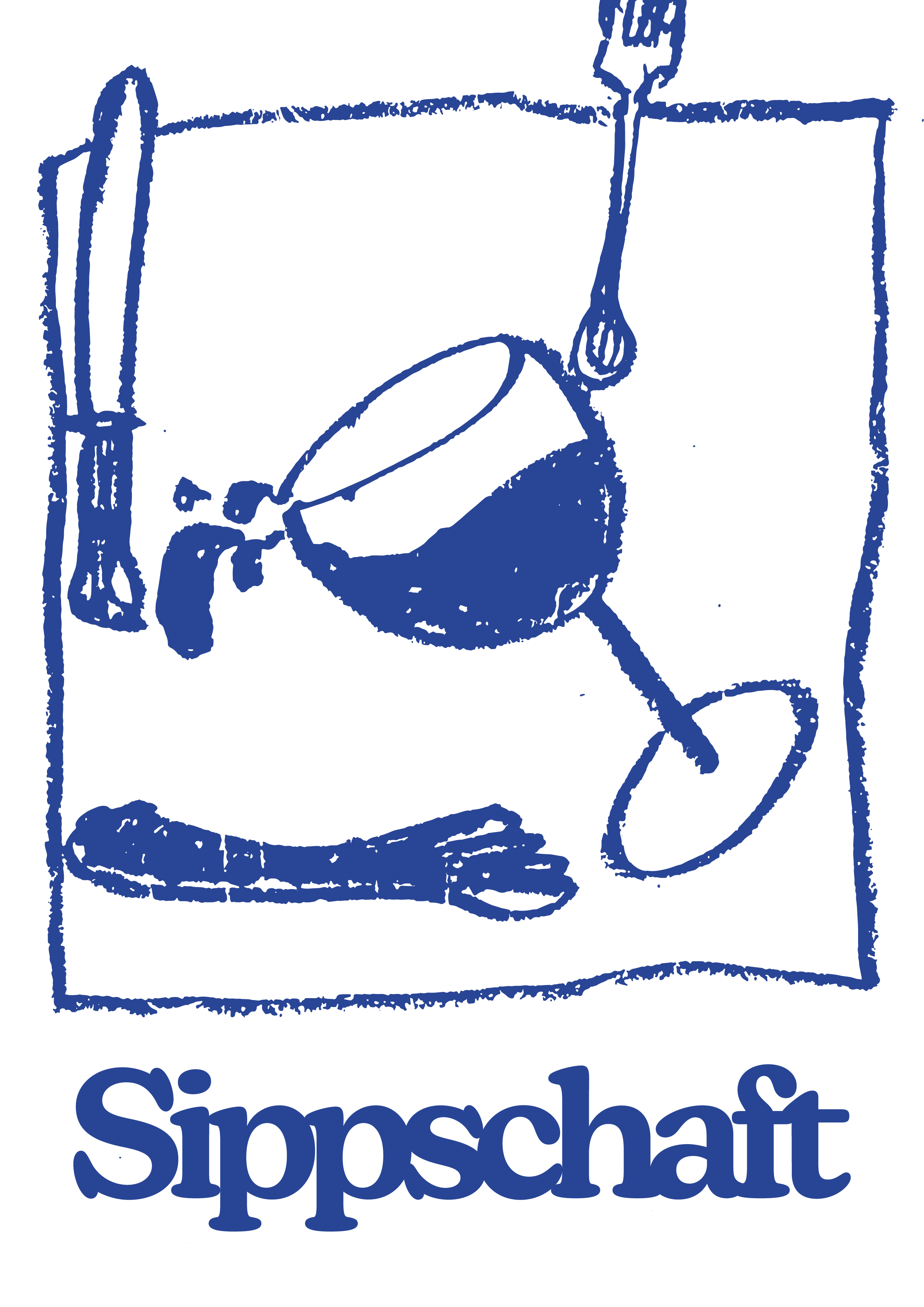
The brand's visual identity began with a moodboard, followed by an evolving logo design process. The signature illustration of wine glasses originated from a colored pencil sketch I created one evening at home. I experimented with oil pastels and other mediums before digitizing the final version in Illustrator. For the logo typeface, Marco wanted a bold, standout font rather than a traditional serif, reinforcing the brand’s modern and approachable vibe.
I also worked on initial wine label proposals, though Marco ultimately chose an illustration from his 2023 Grauburgunder, Eskapade. Due to creative differences, we decided to part ways. However, I’m proud to have contributed to the Sippschaft brand concept and logo design, and I wish Marco all the best with his supperclub pop-ups and wine business.

Initial Moodboard.
First Logo Proposal.

Second Logo Proposal.


Finished Logo, now in use.

Gif for IG Story.

Rejected wine labels.