Out of Ours.
Vintage.
Art Direction/Branding
-

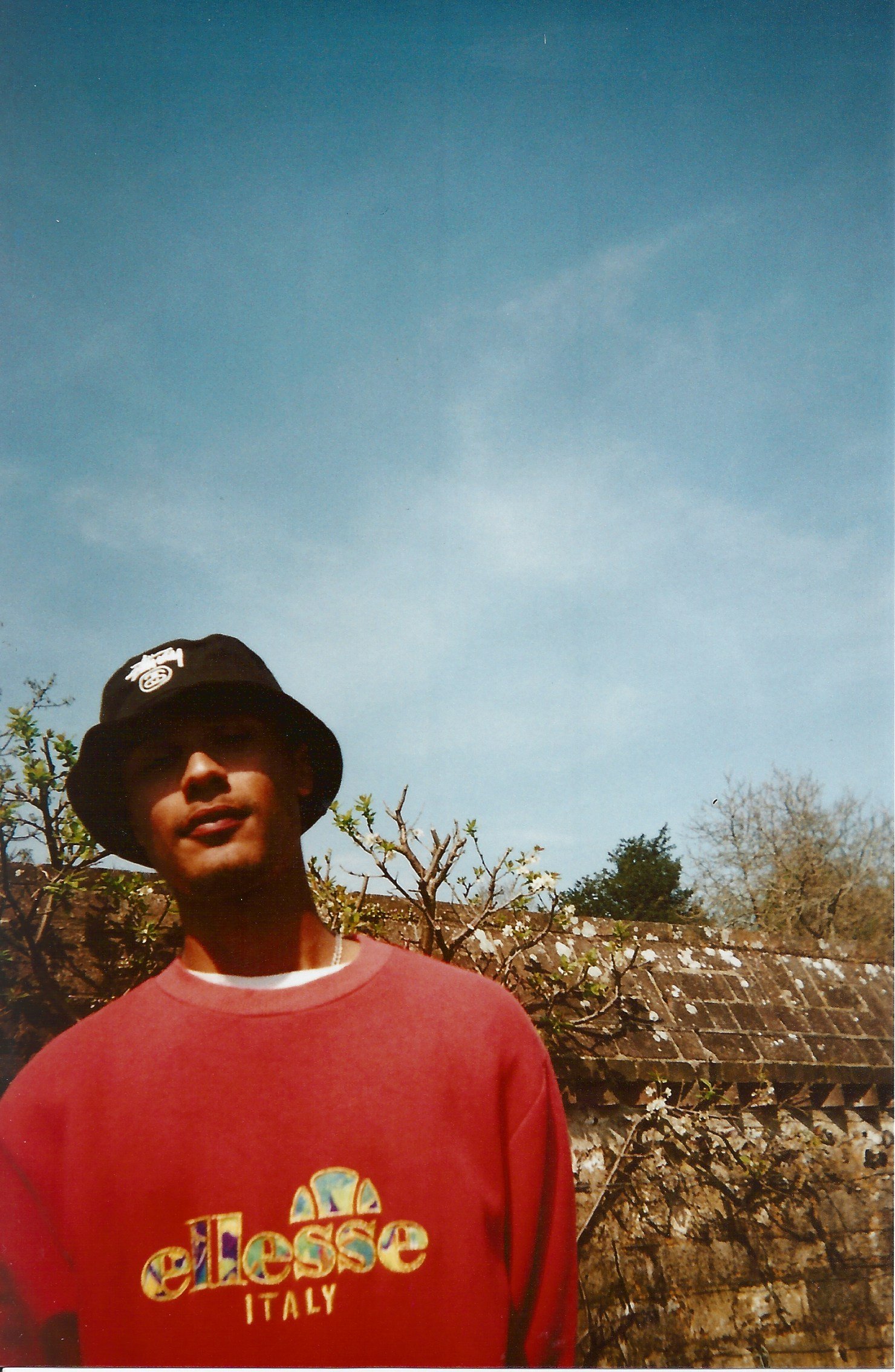
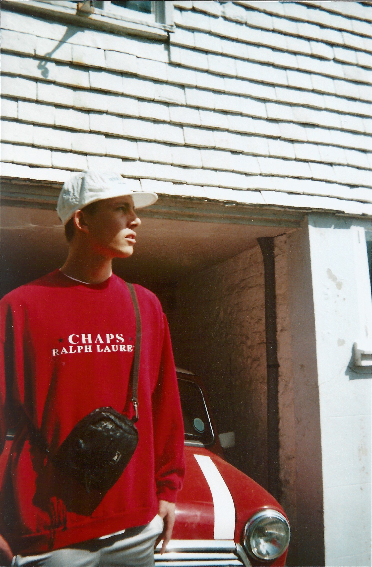
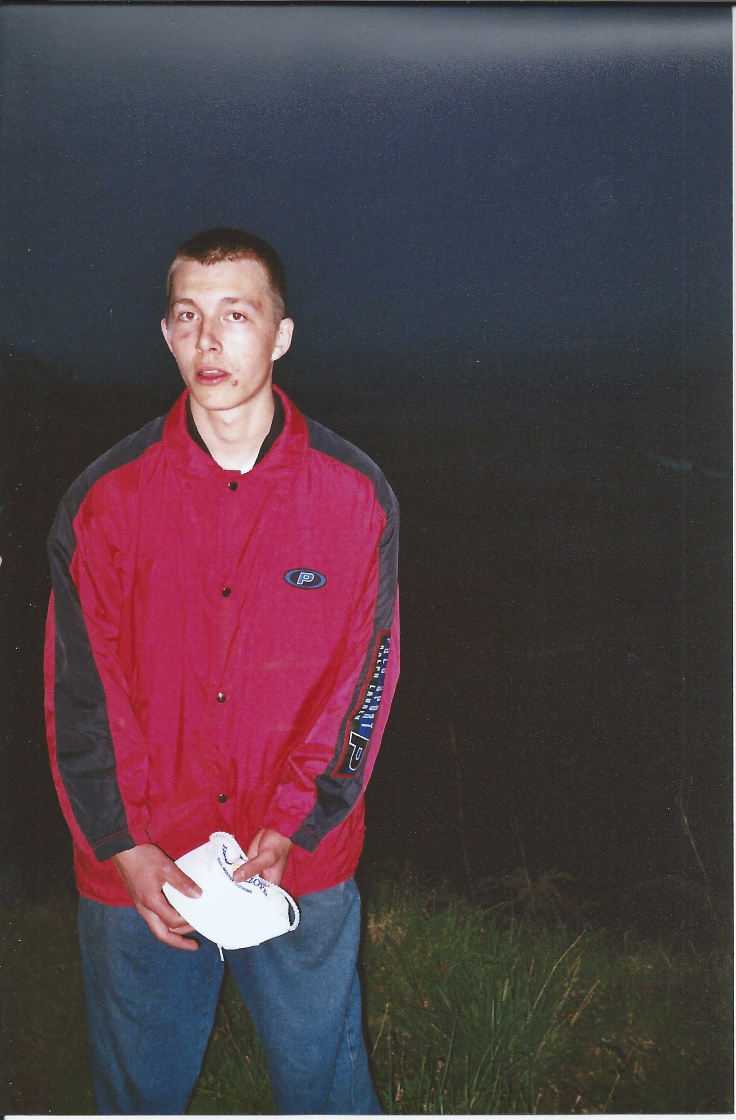
As the hand-picked vintage clothing scene was booming in the UK, a lot of long standing collectors gained notoriety. Alex Wilson, Tom Crawford and myself thought about starting our own online shop. First on Depop and then with Pop-ups at Glazed Donuts in Brighton. The 3 of us did a shoot in 2017 in St. Ann’s Well Gardens in Brighton & Hove and me and Tom did another shoot in Lewes in 2018.
-

All 3 of us were at Tom’s to brainstorm a Brand name, after a couple of hours, we came up with Out of Ours. It encapsulated the identity of the brand as we were selling clothes out of our own collection, and 2 of us were doing this as a side hustle from our full-time obligations. The circular logo to the left is the second iteration of the initial logo.
-

Tom had been collecting Supreme and Nike since a young teen and made OOO his full-time career. The 2 blackletter type logos are the current identities used on the website outofoursvintage.com and IG. As a lot fashion design was veering away from sans serifs and a lot of rap merch and high fashion started using blackletter fonts, I went for a similar direction for the new branding. Even though no longer live in Brighton I continue to support Tom by designing stickers and producing content for instagram such as GIFs and other animations, The website went online in 2019.
-

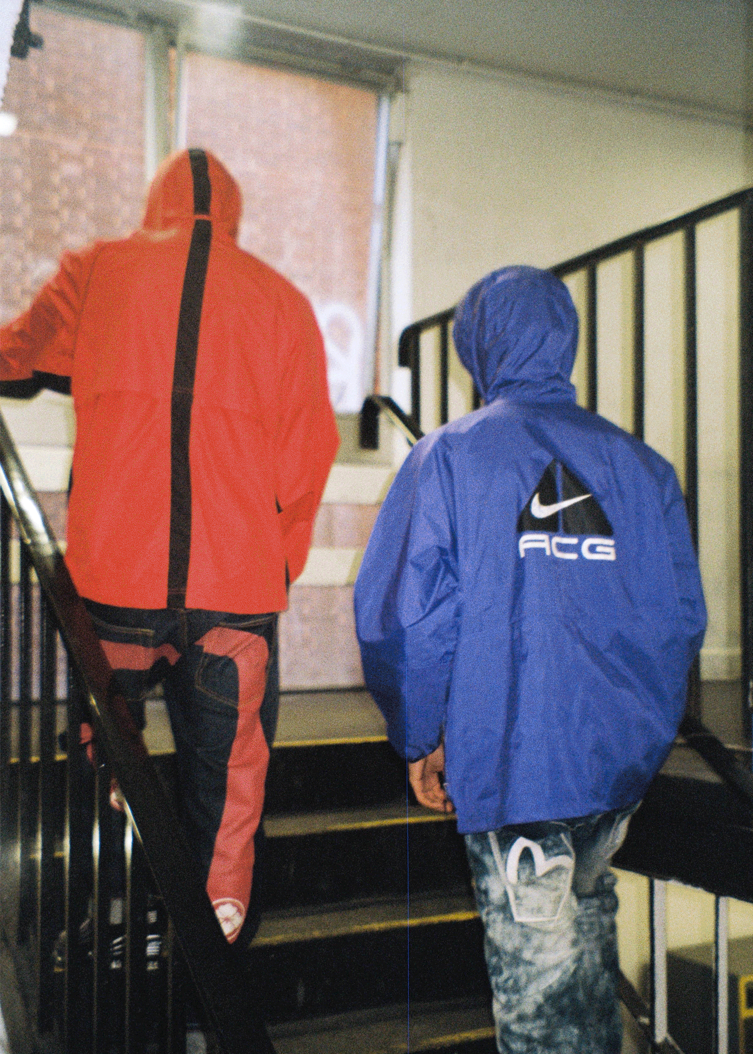
Using Gifs as a tool in content creation I learned how to use AE efficiently, above is one of the earlier GIFS from 2018. Currently the stock has expanded far beyond 90s nostalgia and has started stocking tech-wear brands as well as high end fashion house accessories.
Shoots.